 |
|
|
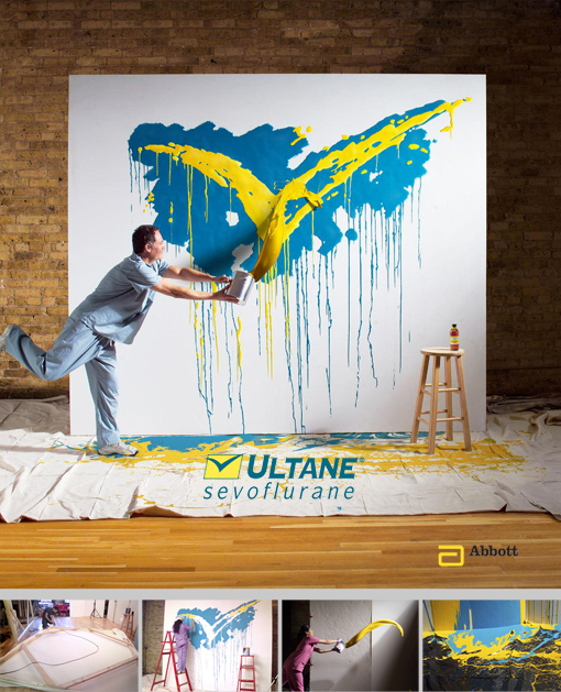
“Fun-Job”, this is what the e-mail's subject read. Well, was that ever an understatement! When I opened the attached PDF, I saw a picture of an anesthesiologist flinging a bucket of paint at a canvas upon which a huge blue and yellow check mark was painted. The check mark is the product's logo. The interpretation of the check needed to be precisely as the client had seen in the layout, including all the drips and runs. Everything except the paint flinger had to be replaced exactly, although he did a bang-up job. The canvas measured ten by eleven feet and the frame was made of mitered 2x4's. The canvas was stretched and stapled, then primed. Paint for the logo was matched exactly to the yellow and blue color used in the layout. Once the gesso dried we used an overhead projector to trace the check mark along with all the paint drippings. Duplication was perfect this way. Every drip and run was exact. Production of the frame, canvas and painting was simultaneous with the orchestration of a massive casting for both a male and female model to throw paint on our canvas. Our selected talent went through the motion of throwing the paint on our wall, time and time again, with an empty can. Next is where being a kid helps… the actual paint tossing! This fun was accomplished with nearly a dozen well thrown paint flings by my sharpshooter studio manager at a plastic backdrop. The compositing of the model in front of the canvas tossing the paint was combined with separate paint flings, including splashes of paint that fell on our plastic drop cloth. The retouchers at Alter Image masterfully assembled our files. The outcome of the paint toss was perfect. By being as perfect as we were, we had our “fun-job”. The entire production went smoothly and was beautifully orchestrated as if we were the “Blue Angels” flying team. I like fun and perfect. Thank you everybody.
|
|